
Campri Reimagined
ABOUT
The purpose is to rejuvenate the Campari brand with a new Italian and international "ready-to-drink" aperitivo small bottle based on the original Campari Spritz recipe. To advertise with a fictitious worldwide brand campaign communication, it should be young, brave, and exciting, with a strong personality that is influenced by the Campari brand values.
NAMING OF THE BRAND
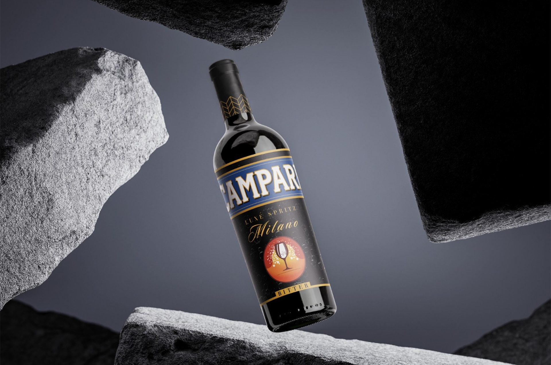
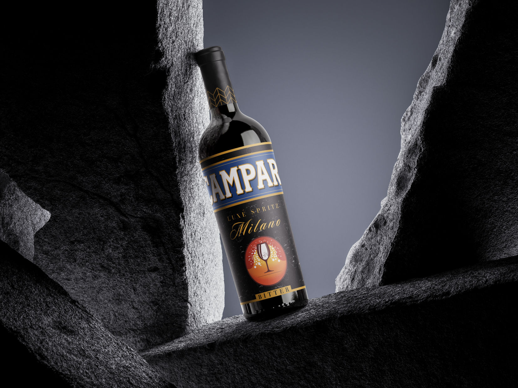
"Campari Luxé Spritz" has been painstakingly developed to conjure a sense of luxury, elegance, and the energizing essence of the spritz experience. This exceptional libation is more than just a drink; it is a monument to the creativity and finesse that characterizes the Campari brand. The Spritz experience is nothing short of a trip into luxury. The effervescent bubbles dance over the tongue, revealing a symphony of tastes that are both elegant and invigorating, giving a lingering feeling of enjoyment. It pays tribute to the spritz's historical legacy while modernizing it for the modern aficionado.
TARGET AUDIENCE:
Adventuresome young adults (legal drinking age), ages 21 to 35, who want a modern and exciting drinking experience, are the target market for Campari Luxe Spritz . The product is positioned as the preferred option for parties, events, and downtime.
FONT USED
Primary Font : Didot LT Pro
Secondary Font: Sloopscript Pro
Supporting Font: Qanoar
PRODUCT LOGO
classy and contemporary logo that features a stylized spritz glass with bubbly bubbles to represent the elegance and sparkle of the drink. It displays the red and orange hues of both campari and aperol.
SUMMARY
With Campari Luxe Spritz, a daring and alluring beverage option that unites tradition and modernity is presented. This product, which combines the flavours of Campari and Aperol, is positioned to take the lead among a younger demographic that wants advanced yet enjoyable drinks. Page
.png)
.png)
.png)
.png)

.png)


.png)